Drought Visualizations on Map
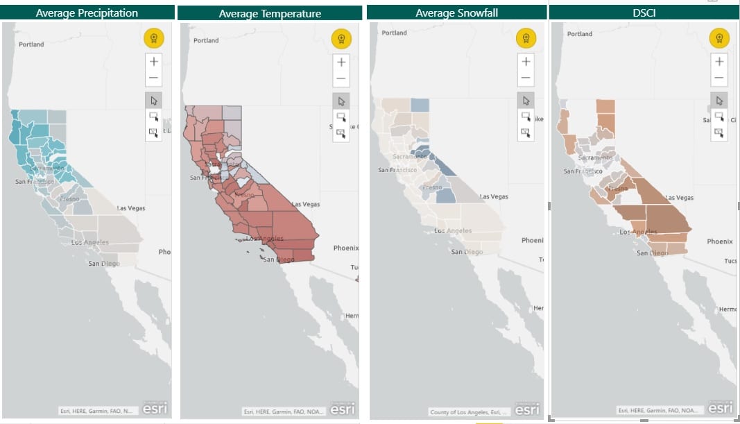
The four heatmaps above indicate various parameters & their intensity which is portrayed county wise in the heat maps. The average Precipitation heat map shows the county-wise representation of the average precipitation in the state of California. Similarly, average Temperature and the average Snowfall indicates the intensity of temperature and snowfall as per county over time. The DSCI heatmap indicates the severity of Drought. The darker the color the higher the severity of drought in that county.
Conclusions that can be drawn from this dashboard are:
- Over time, the counties in the northern regions of the state of California faces high precipitation and moderately high snowfall as compared to the counties in the southern region.
- As a result, the Average temperature in the counties in the southern regions have a higher average temperature than counties in the Northern part of the state of California.
- Consequently, the counties in the southern region of California has higher Severity Index of Drought as compared to other portions of the state of California.
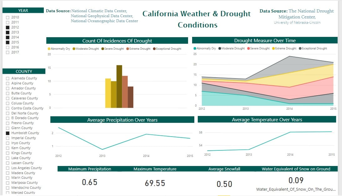
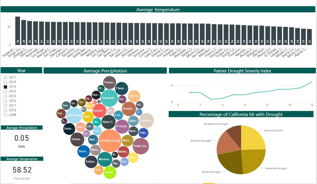
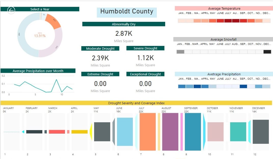
Drought Analysis Visualizations
California is experiencing consecutive years of drought. As of late 2017, 47% of California was experiencing exceptional drought and more than 94% of the state was facing drought conditions that ranged from severe to exceptional.
ThirdEye developed these visualizations by analyzing and correlating a variety of data and information on California’s current drought conditions. ThirdEye leveraged Microsoft PowerBI for developing these data visualizations.


