Drought Analysis for the State of California.
California is experiencing consecutive years of drought. As of late 2017, 47% of California was experiencing exceptional drought and more than 94% of the state was facing drought conditions that ranged from severe to exceptional.
ThirdEye Data has analyzed a variety of data and information on the current drought conditions in California. This technical report provides a detailed analysis of California’s drought seasons from 2010-2017 with comparisons, where applicable, to previous droughts; a summary of the key regulatory requirements that at certain times limit water deliveries.
Summary
This analysis gives a visual representation on the several parameters that have affected and caused drought in California along with the trends which every individual county follows on drought Behavior.
- The indicator gives a broad overview of drought conditions in the United States.
- Indices such as the U.S. Drought Monitor seek to address the limitations of the PDSI by incorporating many more variables.
- The dashboard is produced by combining data from several different sources. These data are combined to reflect the collective judgment.
Data Set Sources:
Data has been collected from the following sources :
Download this report
What is Drought?
A drought is a period of below-average precipitation in a given region, resulting in prolonged shortages in the water supply, whether atmospheric, surface water or groundwater. A drought can last for months or years or may be declared after as few as 15 days.
Water quality degradation, surface and groundwater level declines, land subsidence – all are impacts of drought. Understanding the impacts of drought can help mitigate drought-related issues and prepare for future dry periods.
California Drought Analysis 2010–2017: ThirdEye Data Insights
- National Climatic Data Centre,
- National Geophysical Data Centre,
- National Oceanographic Data Centre
- The National Drought Mitigation Centre, University of Nebraska-Lincoln
- Data Availability
NCEI provides access to monthly values of the PDSI averaged across the entire contiguous 48 states, which EPA downloaded for this indicator. This data is available here.
This website also provides access to monthly PDSI values for nine broad regions, individual states, and 357 smaller regions called climate divisions. PDSI values are calculated from precipitation and temperature measurements collected by weather stations within each climate division. Individual station measurements and metadata are available through NCEI’s website
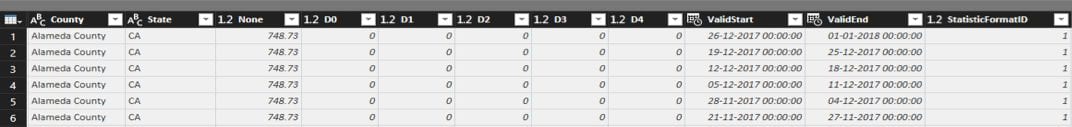
U.S. Lands Under Drought Conditions, 2000–2017 U.S. Drought Monitor data can be obtained from here.
Select “United States” to view the historical data that were used for this indicator. For each week, the data table shows what percentage of land area was under the following drought conditions:
- None
- D0–D4
- D1–D4
- D2–D4
- D3–D4
- D4 alone.
This indicator covers the time period from 2000 to 2017. Although data were available for parts of 1999 and 2016 at the time EPA last updated this indicator. Drought Monitor data are based on a wide variety of underlying sources. Some are readily available from public websites; others might require specific database queries or assistance from the agencies that collect and/or compile the data. For links to many of the data sources, see here.
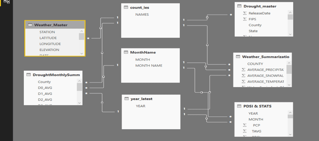
Working with the Data Sets
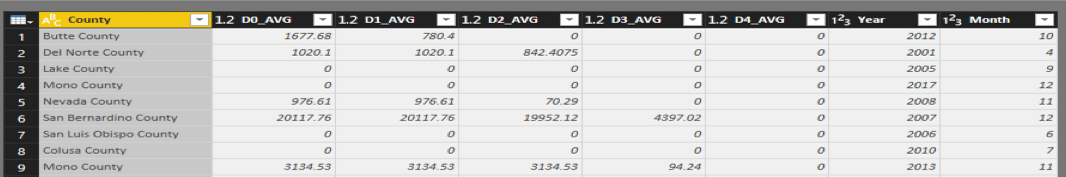
The Drought Master Data Set Contains data in the following format:
Which upon aggregation on the basis of month and year has been modified to the following format:
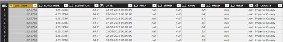
The Weather Master data set contains data in the following format:
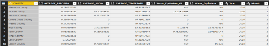
Which similarly upon aggregation on the basis of month and year has been modified to the following format:
The relationships among the tables is shown below:
The Analytical Dashboards Explained
California
The landing page gives a user a deep insight about what the report is all about. The dashboard helps a user to find out statistics about a particular County or a combination of Counties of the state of California for a particular year or over a range of years.
The dashboard shows the count of incidences of drought that has been recorded for the year or for the range of years. It also shows the increase or decrease of drought measures over time. The line charts have been used to plot the trend that the average precipitation & the average temperature is following for the year or for over the range of years.
The drilldown feature in each line chart will give a user the ability to have an insight about the trend that average temperature & precipitation followed over months.
The cards give reading of maximum Precipitation, Temperature, Average Snowfall & water equivalent of snow on ground for the particular county or selected counties for a particular selected year or over a range of years.
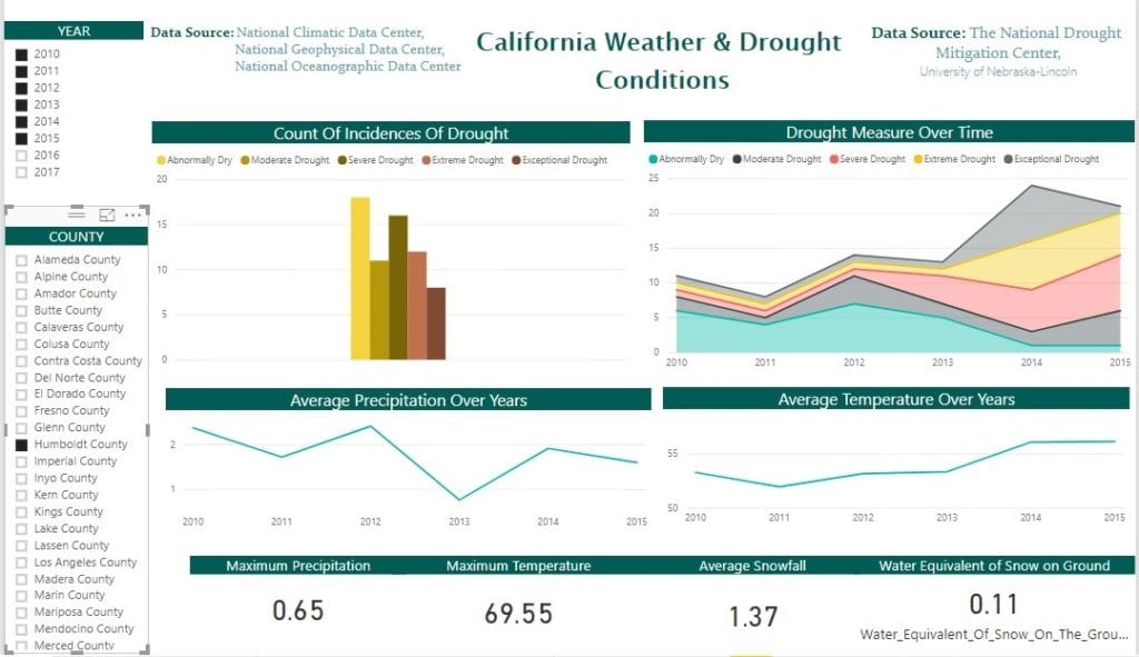
Figure: For Humboldt County the details which range from the year 2010 – 2015 are shown.
Overall Report on California
This dashboard gives a user a broad and elaborate report on entire California. Average Temperature bar graph shows the average temperature of various counties in a sorted order for a specific selected year. Average Precipitation bubble chart shows the counties as a bubble whose size indicates the average precipitation for the year. On selecting a particular bubble that is a specific county its average temperature will be highlighted. On clicking the right button of mouse and selecting the drill through option a user will be navigated to the County wise Drought and Weather Representation dashboard where the user will get a deep insight into the county.
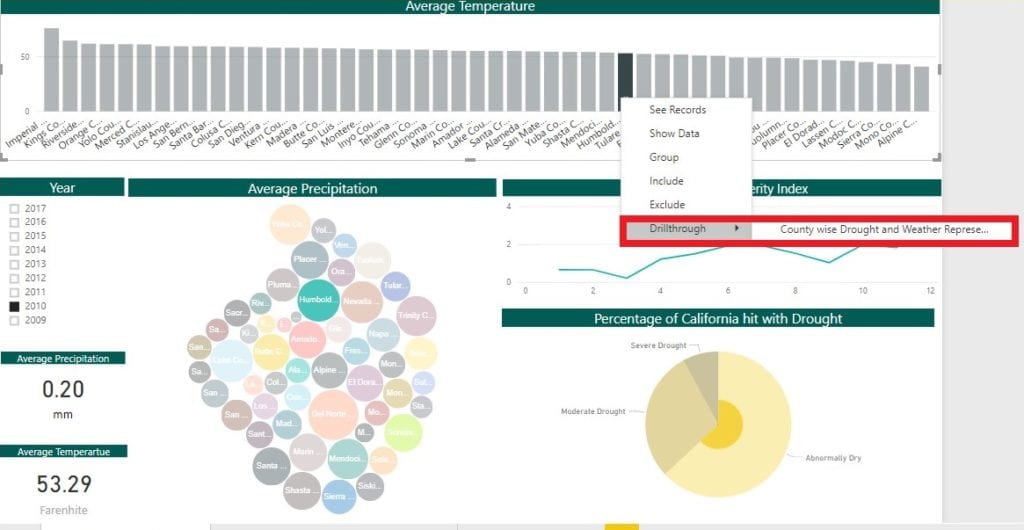
Figure: How to use the drill through feature
The Palmer Drought Severity Index shows the month wise insight on the PDSI for the entire state of California for a particular year. The Percentage of California hit with drought Pie chart shows the portion of land that has been affected with the various categories of drought for a specific year or for a range of year.
The cards give reading of average Precipitation & average Temperature for the selected county for a particular year or over a range of years.
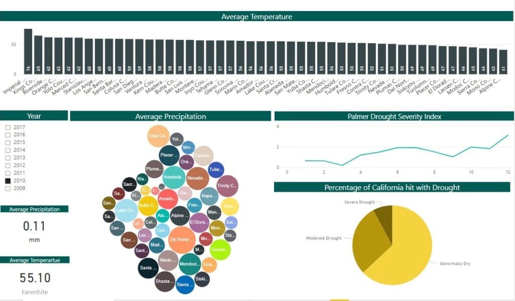
Figure: The overall Report on California for the year 2010 is shown
County wise Drought and Weather Representation
On drilling through a Specific year, a user will be led to this dashboard, which will give one a full insight about the trend and behaviour of Drought & weather that the county follows.
The tabular heatmaps shows the trend that temperature, precipitation and snowfall follows, month wise for a selected year.
The line chart shows the precipitation curve month wise & the data cards shows the portion of land of the county that has been hit with that category of Drought over the year in miles square as its unit.
The Drought Severity & Coverage Index is an experimental method for converting drought levels from the U.S. Drought Monitor map to a single value for an area. DSCI values are part of the U.S. Drought Monitor data tables. If you want to compute it yourself, using cumulative Drought Monitor data, add the values for D0 through D4 to get the Drought Severity Classification Index. Or, to see more math, use categorical (not cumulative) Drought Monitor data, and compute a weighted sum:
1(D0) + 2(D1) + 3(D2) + 4(D3) + 5(D4) = DSCI
The bar height indicates the Severity of Drought based on the DSCI value. It helps a user to understand the trend that severity of Drought follows over a year and portrays the month on which the county has a tendency to be affected with Drought.
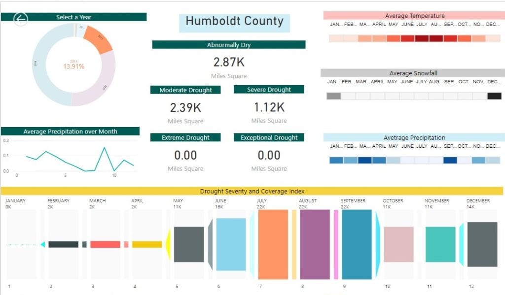
Figure: The overall Report on Humboldt County for the year 2013 is shown
This dashboard gives the insight about Humboldt County. Conclusion that can be drawn from this dashboard is:
- Average Precipitation is low during the month May to October whereas, the average Snowfall is high only during the month of December & January. As a result, the average Temperature increases during May to October
- Hence the severity of Drought is high during May to October.
Representation on Map
The 4 heatmaps indicates various parameters & their intensity which is portrayed county wise in the heat maps. The average Precipitation heatmap shows the county wise representation of the average precipitation in the state of California. Similarly, average Temperature and the average Snowfall indicates the intensity of temperature and snowfall as per county over time. The DSCI heatmap indicates the severity of Drought. The darker the colour the higher the severity of drought in that county.
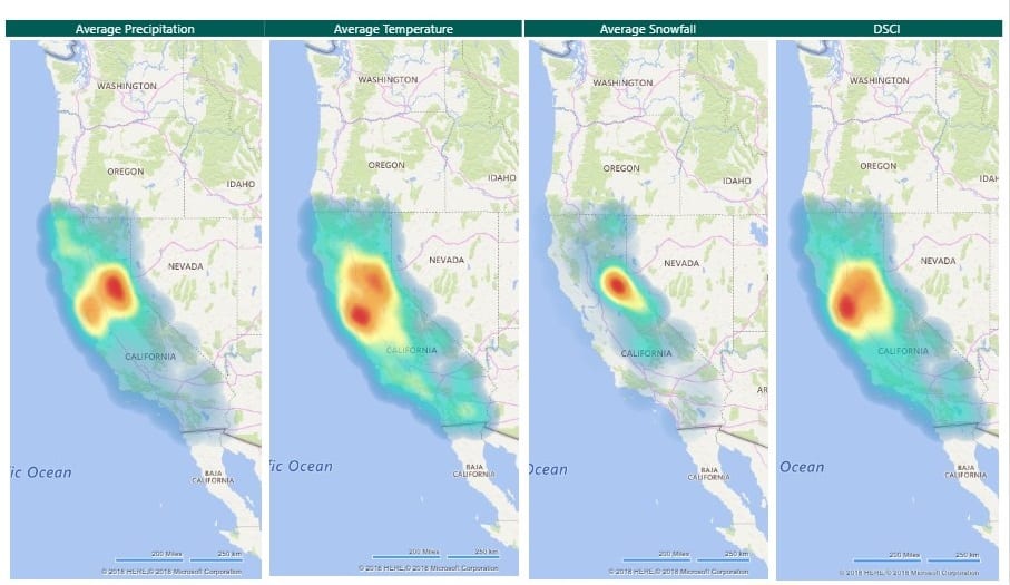
Figure: Heatmap portraying the intensity of various parameters
Conclusions that can be drawn from this dashboard is:
- Over time, the counties in the northern regions of the state of California faces high precipitation and moderately high snowfall as compared to the counties in the southern region.
- As a result, the Average temperature in the counties in the southern regions have a higher average temperature than counties in the Norther part of the state of California.
- Consequently, the counties in the southern region of California has higher Severity Index of Drought as compared to other portions of the state of California.
Data Limitations
Factors that may impact the confidence, application, or conclusions drawn from this indicator are as follows:
- The indicator gives a broad overview of drought conditions in the United States. It is not intended to replace local or state information that might describe conditions more precisely for a particular region. Local or state entities might monitor different variables to meet specific needs or to address local problems. As a consequence, there could be water shortages or crop failures within an area not designated as a drought area, just as there could be locations with adequate water supplies in an area designated as D3 or D4 (extreme or exceptional) drought.
- Because this indicator focuses on national trends, it does not show how drought conditions vary by region. For example, even if half of the country suffered from severe drought, figures could show an average index value close to zero if the rest of the country was wetter than average.
- Although the PDSI is arguably the most widely used drought index, it has some limitations that have been documented extensively in the literature. While the use of just two variables (precipitation and temperature) makes this index relatively easy to calculate over time and space, drought can have many other dimensions that these two variables do not fully capture. For example, the PDSI loses accuracy in areas where a substantial portion of the water supply comes from snowpack.
- Indices such as the U.S. Drought Monitor seek to address the limitations of the PDSI by incorporating many more variables. The Drought Monitor is relatively new, however, and cannot yet be used to assess long-term climate trends.
- The dashboard is produced by combining data from several different sources. These data are combined to reflect the collective judgment of experts and in some cases, are adjusted to reconcile conflicting trends shown by different data sources over different time periods.
Sources of Uncertainty
Error estimates are not readily available for national average PDSI, the U.S. Drought Monitor, or the underlying measurements that contribute to this indicator. It is not clear how much uncertainty might be associated with the component indices that go into formulating the Drought Monitor or the process of compiling these indices into a single set of weekly values through averaging, weighting, and expert judgment.
Statistical/Trend Analysis
This indicator does not report on the slope of the trend in PDSI values over time, nor does it calculate the statistical significance of this trend. This information is currently not available from NOAA’s NCEI. Because data from the U.S. Drought Monitor are only available for the most recent decade, this metric is too short-lived to be used for assessing long-term climate trends. With continued data collection, future versions of this indicator should be able to paint a more statistically robust picture of long-term trends in Drought Monitor values.
Drought Analysis Visualizations
California is experiencing consecutive years of drought. As of late 2017, 47% of California was experiencing exceptional drought and more than 94% of the state was facing drought conditions that ranged from severe to exceptional.
ThirdEye developed these visualizations by analyzing and correlating a variety of data and information on California’s current drought conditions. ThirdEye leveraged Microsoft PowerBI for developing these data visualizations.
Transforming Enterprises with
Data & AI Services & Solutions.
ThirdEye delivers Data and AI services & solutions for enterprises worldwide by
leveraging state-of-the-art Data & AI technologies.