


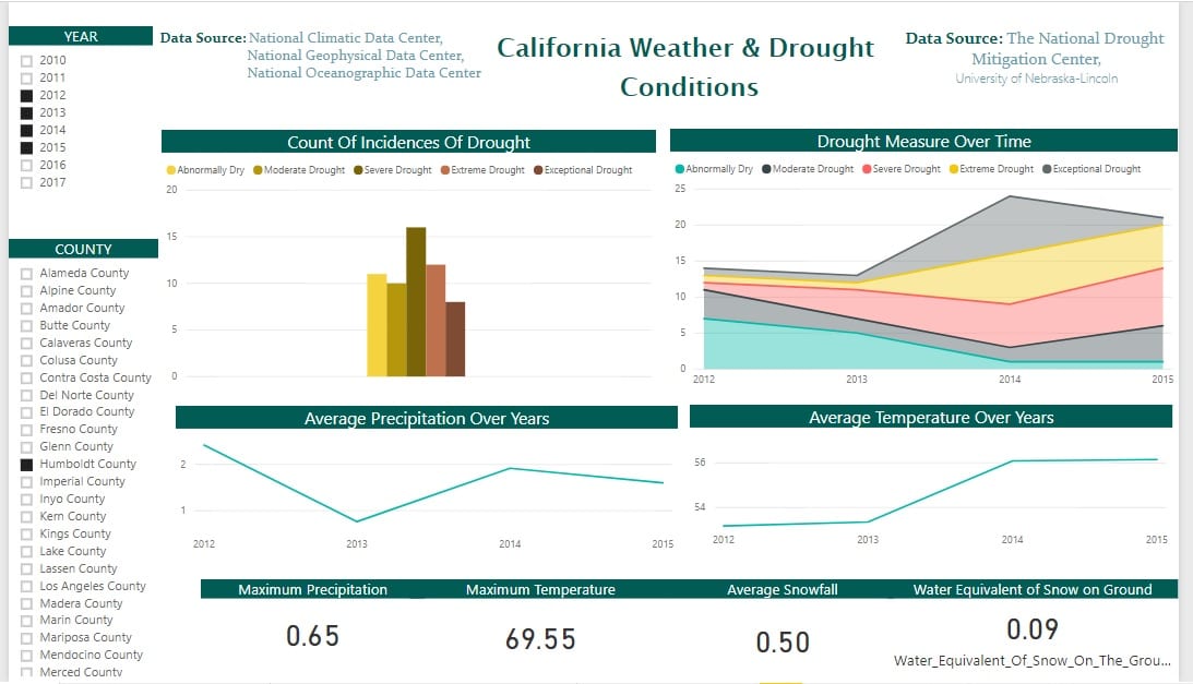
Drought Analysis Dashboard
Drought Analysis Report for the Whole State of California
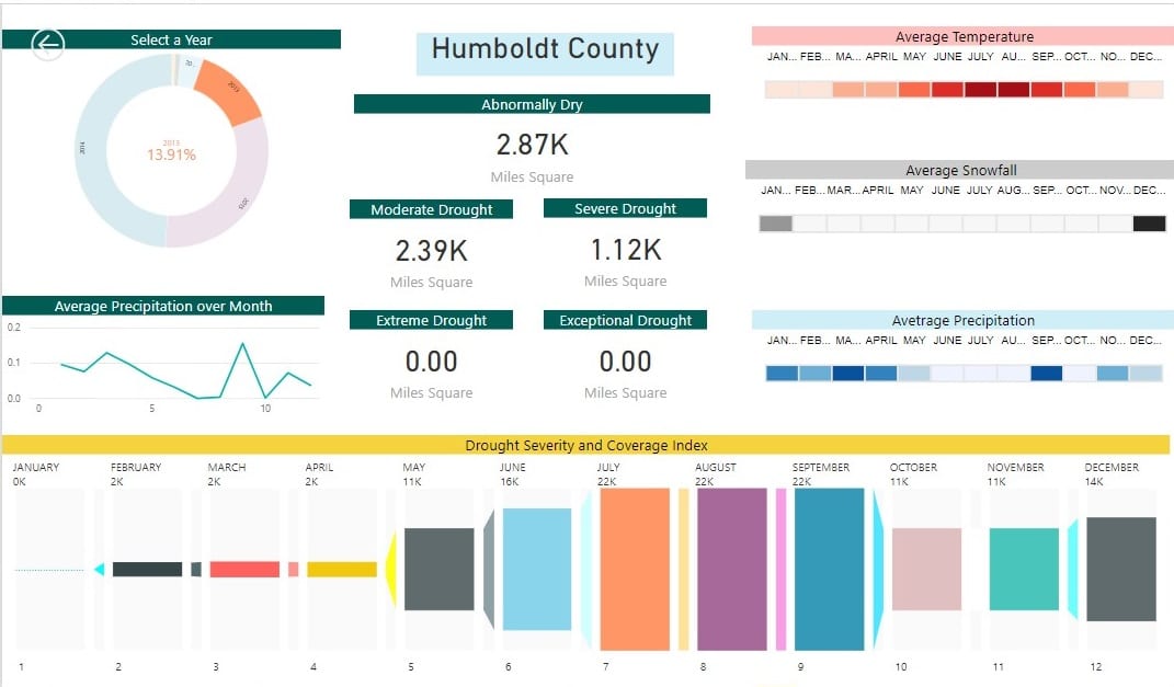
County-wise Drought and Weather Visualizations
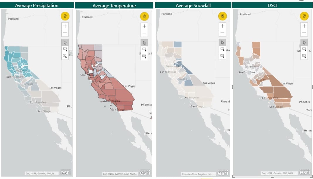
Drought Visualizations on Map
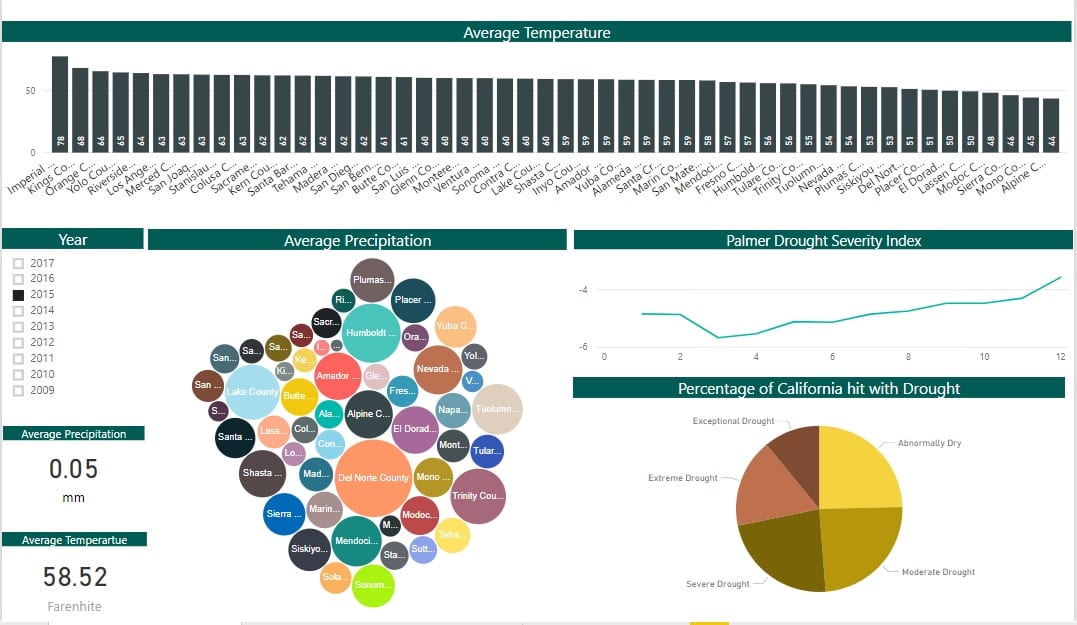
Drought Analysis Report for the Whole State of California
This dashboard gives a user a broad and elaborate report on entire California. Average Temperature bar graph shows the average temperature of various counties in a sorted order for a specific selected year. Average Precipitation bubble chart shows the counties as a bubble whose size indicates the average precipitation for the year.
On selecting a particular bubble that is a specific county its average temperature will be highlighted. On clicking the right button of the mouse and selecting the drill through option a user will be navigated to the County wise Drought and Weather Representation dashboard where the user will get a deep insight into the county.
The Palmer Drought Severity Index (PDSI) uses readily available temperature and precipitation data to estimate relative dryness. It is a standardized index that spans -10 (dry) to +10 (wet). It has been reasonably successful at quantifying long-term drought. As it uses temperature data and a physical water balance model, it can capture the basic effect of global warming on drought through changes in potential evapotranspiration.
The Palmer Drought Severity Index shows the month wise insight on the PDSI for the entire state of California for a particular year. The Percentage of California hit with drought Pie chart shows the portion of land that has been affected with the various categories of drought for a specific year or for a range of year.
The cards give reading of average Precipitation & average Temperature for the selected county for a particular year or over a range of years.
Drought Analysis Visualizations
California is experiencing consecutive years of drought. As of late 2017, 47% of California was experiencing exceptional drought and more than 94% of the state was facing drought conditions that ranged from severe to exceptional.
ThirdEye developed these visualizations by analyzing and correlating a variety of data and information on California’s current drought conditions. ThirdEye leveraged Microsoft PowerBI for developing these data visualizations.
Transforming Enterprises with
Data & AI Services & Solutions.
ThirdEye delivers Data and AI services & solutions for enterprises worldwide by
leveraging state-of-the-art Data & AI technologies.